> ## Documentation Index
> Fetch the complete documentation index at: https://docs.glowstudio.ai/llms.txt
> Use this file to discover all available pages before exploring further.
# Agency Theme
**The design preview interface:**
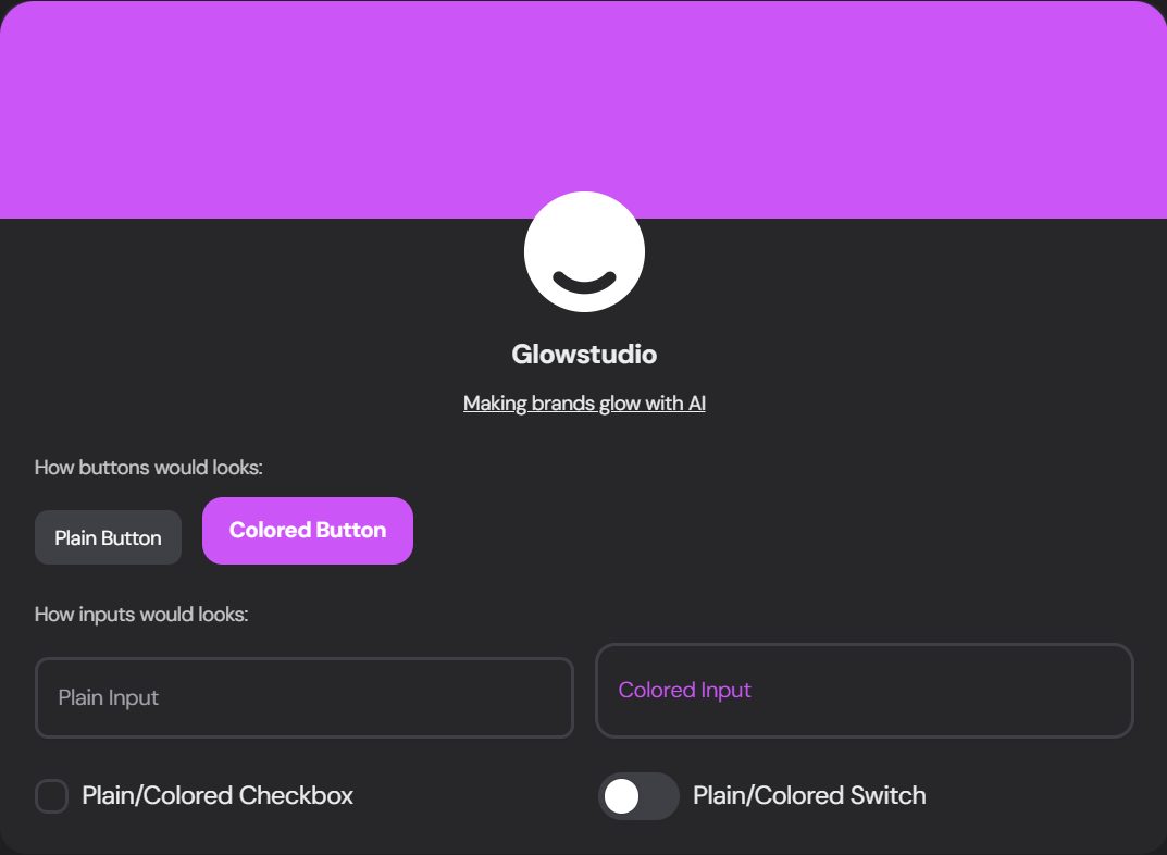 Navigate to the Theme tab in the agency manager to access the following customization features:
### Font Family
Select a font that resonates with your brand from the extensive library of **free** font from [Google Fonts](https://fonts.google.com).
### Color Usage
Choose how extensively you want to use your brand colors throughout the dashboard:
Navigate to the Theme tab in the agency manager to access the following customization features:
### Font Family
Select a font that resonates with your brand from the extensive library of **free** font from [Google Fonts](https://fonts.google.com).
### Color Usage
Choose how extensively you want to use your brand colors throughout the dashboard:
 Simple design with primary color used sparingly
More branded look with increased color usage
Mix of colors with trendy gradient touches
### Theme Variant
Select the overall style of your dashboard elements:
Simple design with primary color used sparingly
More branded look with increased color usage
Mix of colors with trendy gradient touches
### Theme Variant
Select the overall style of your dashboard elements:
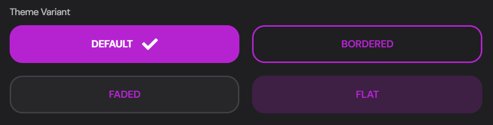 Standard, modern look
Elements with defined borders
Subtle, softer appearance
Minimalist, flat design
### Agency Brand Colors
Define your brand's color palette:
Standard, modern look
Elements with defined borders
Subtle, softer appearance
Minimalist, flat design
### Agency Brand Colors
Define your brand's color palette:
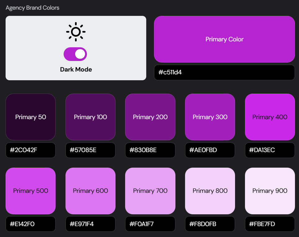 Choose your main brand color using the color picker or enter the HEX code
Fine-tune different shades of your primary color for various UI elements
Enable or disable dark mode for your dashboard
### Client Dashboard Custom CSS
For advanced customization, you can add custom CSS to fine-tune your dashboard's appearance:
Choose your main brand color using the color picker or enter the HEX code
Fine-tune different shades of your primary color for various UI elements
Enable or disable dark mode for your dashboard
### Client Dashboard Custom CSS
For advanced customization, you can add custom CSS to fine-tune your dashboard's appearance:
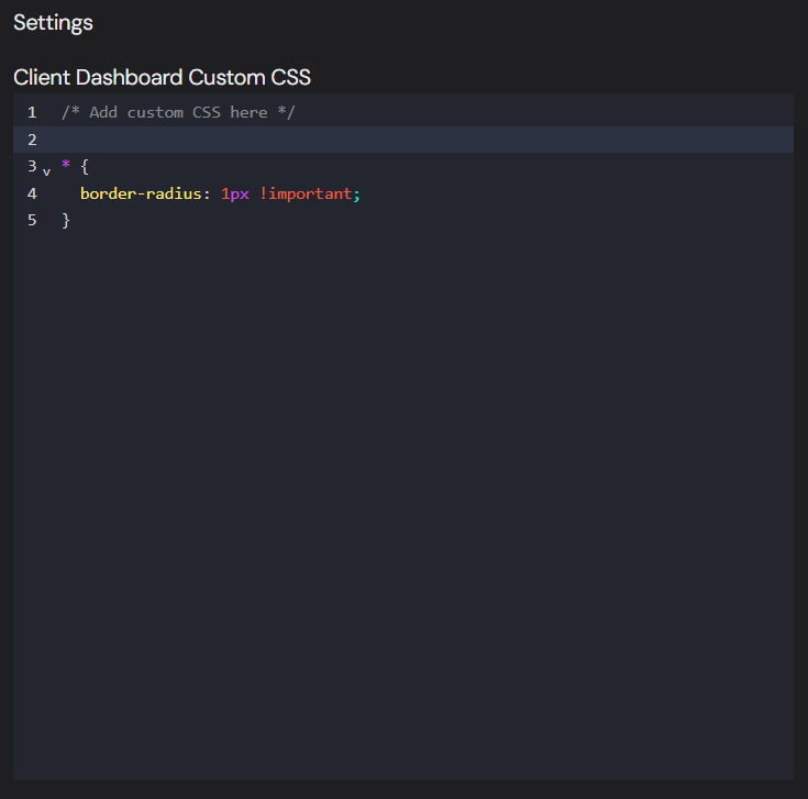 Use **custom CSS** to make precise adjustments to your dashboard's look and feel. Be cautious with your changes to maintain overall design consistency.
```css Example Custom CSS
/* This example makes the corners more square, nice way to imitate website design for brand consistency */
* {
border-radius: 1px !important;
}
```
Use **custom CSS** to make precise adjustments to your dashboard's look and feel. Be cautious with your changes to maintain overall design consistency.
```css Example Custom CSS
/* This example makes the corners more square, nice way to imitate website design for brand consistency */
* {
border-radius: 1px !important;
}
```